The making of Darkmatter's landing page
I was happy to see a lot of positive feedback about Darkmatter’s landing page last week. So when I got an email asking what goes into designing something like that, I thought it might be a good topic to dive into.
The truth is, I don’t have a particular process or a playbook. The way I work is really similar to the “draw the rest of the owl” meme. I think what would a page header look like and once that’s done, I move on to the rest of the page.
Usually I have a rough image of what I want it to look like in my head. Funny how it’s always prettier in my head than “on paper”. I code something that loosely resembles that image and tweak it until it feels right. I prefer to start with an idea for one specific thing I’d love to see in my design and then it kind of snowballs into a complete picture.
The header
For Darkmatter I imagined a dark page with a blue glow behind the app demo. I’m sure you’re familiar with the “Linear effect” (like how every new website is dark these days), but I had no choice over this matter. The word “dark” is literally in my app’s name!
Here’s what I started with:
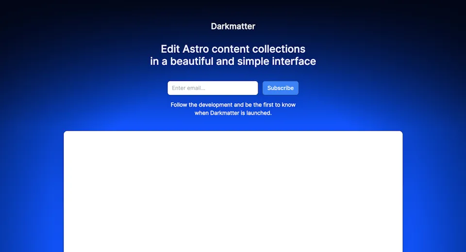
The glow was a little much, so I spent several hours tweaking and overlaying various gradients on top of each other to make it look more blurred and fade out on the edges.

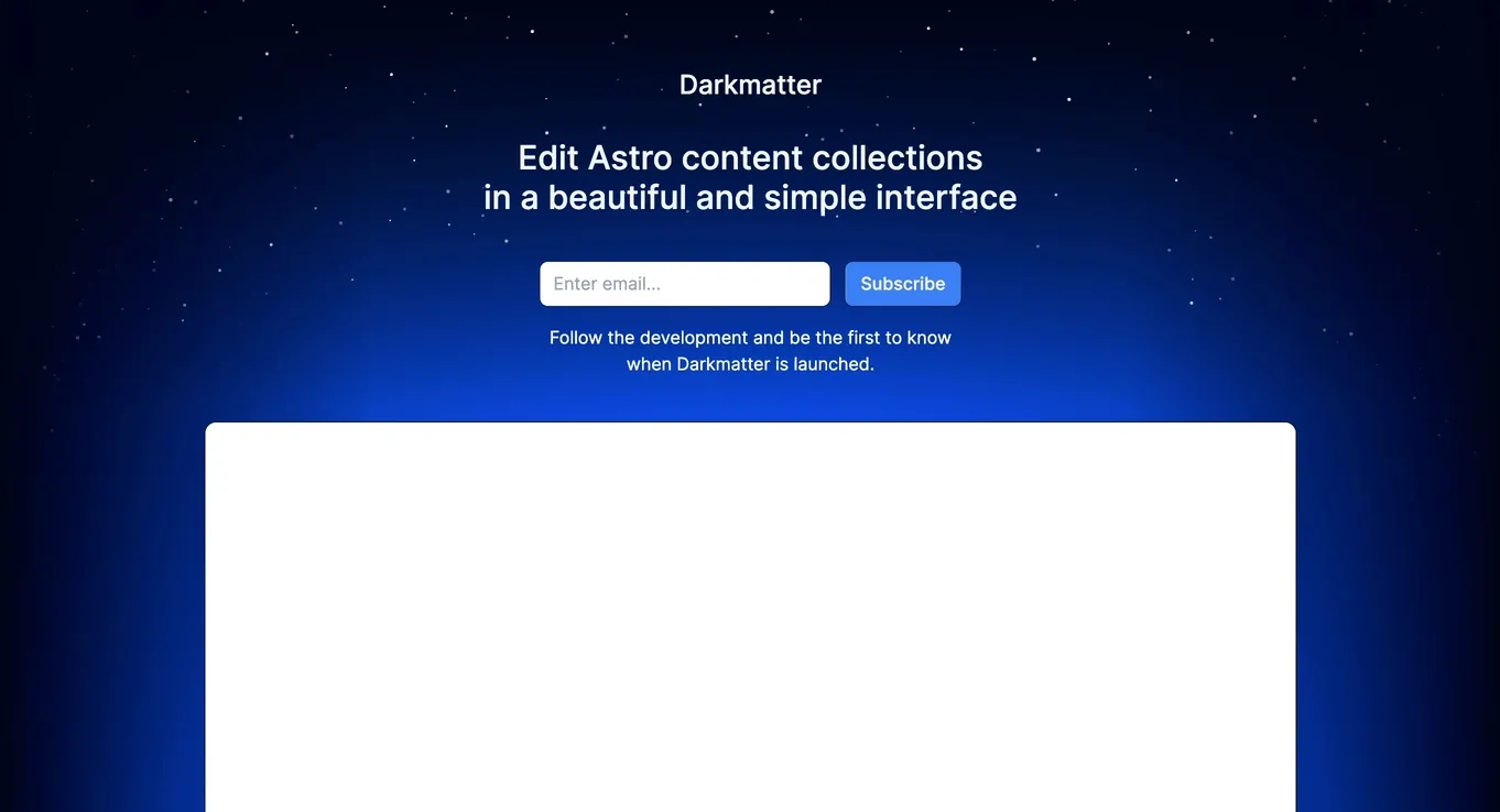
Since Darkmatter’s name suggests a space-related things, naturally I had to add stars too. I thought that randomly positioned small white circles that animate upwards might look cool.
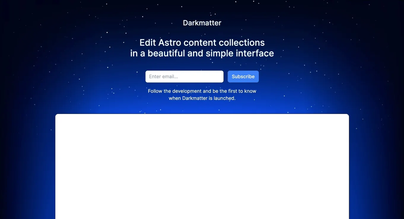
Indeed it looked good, but something felt weird about how the stars moved vertically. That’s where I decided to pull my non-existent math skills (hello, Stack Overflow) and try to make the stars move horizontally following a curve, rather than a straight line. My thinking was that if the blue glow is the Earth, the stars would wrap it around.
Every project I make always has this moment when I spend many hours (or sometimes days) on a really small detail that probably doesn’t matter to most people and each time I’m close to shouting “fuck this” before dropping the idea.
But when it all works out, it’s always worth the effort.
Making these moving stars was that moment exactly. But hey, check out how gorgeous it is!
App screenshot
I like to show the actual screenshot of the app, so that users know exactly how it looks, how it feels and maybe even how it works. However, large screenshots are barely readable from a mobile browser, making them effectively useless.
Long time ago, I learned a fascinating approach to code the “screenshot” with HTML/CSS or SVG from Benjamin De Cock. So that’s what I did.
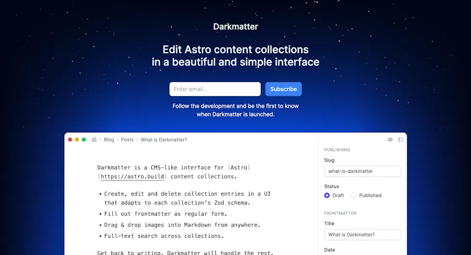
The “screenshot” is crisp on any screen and it even adapts the layout to be just as readable on mobile, as it is on desktop.
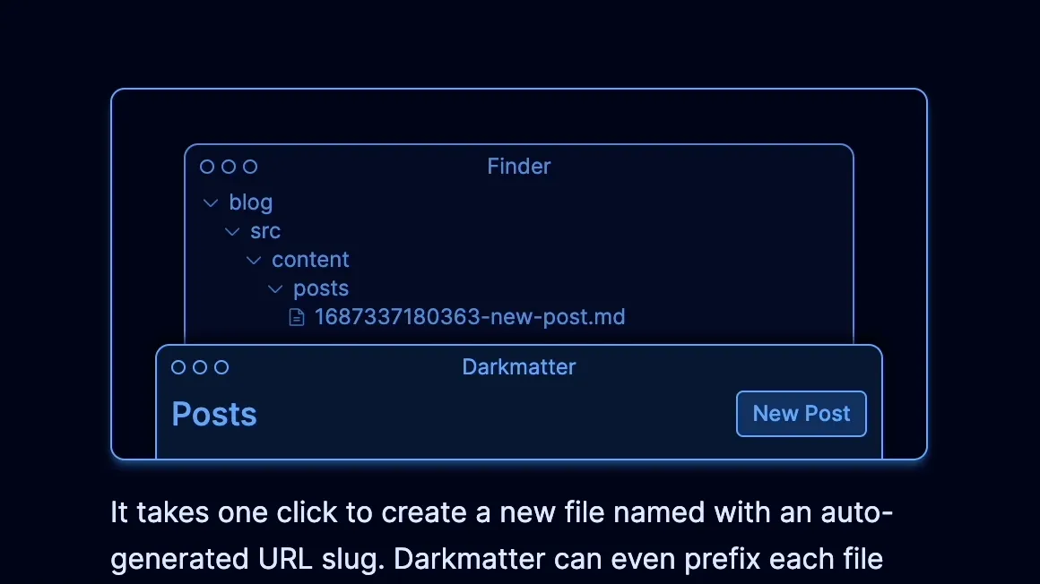
Interactive feature grid
Next, I moved on to showcasing key features of Darkmatter. I knew that those stars in the header set the bar quite high, so whatever I’m going to come up with next has to be at least as cool, if not cooler.
Initially I wanted to code a feature grid, where each feature has an animated illustration of some sort. You’ve seen these hundreds of times by now.
But what if those illustrations were interactive, as if they were tiny demos of the actual app functionality? I decided to give it a shot and I loved the result. Illustration still looks good by default and yet it can become alive!
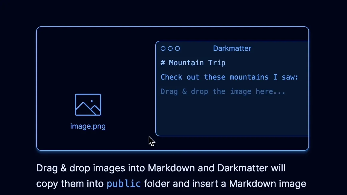
My second favorite is a demo of adding images into Markdown, which uses HTML5 drag & drop APIs.
I realize that after reading this, it may still look like I had everything figured out and I knew exactly what I wanted to design and code. Trust me though, it’s just a ton of random experimentation that eventually might turn into something you can be proud of.
Honestly, Darkmatter was painted in all the colors you can and can’t imagine. Blue, green, pink, rose, you name it, I tried it. I knew that this design wouldn’t be yellow, but I still tried every color, just so I can be confident in the one I picked the first time.
That’s pretty much how it works with everything else. Try stuff, see what feels right, repeat. Oh, and have fun. Otherwise what’s the point of all this?